EREVNA LEADERSHIP
A B O U T
I worked with Erevna since the company’s inception, designing and conceptualizing their entire theme, from logo and branding to email design.
–01
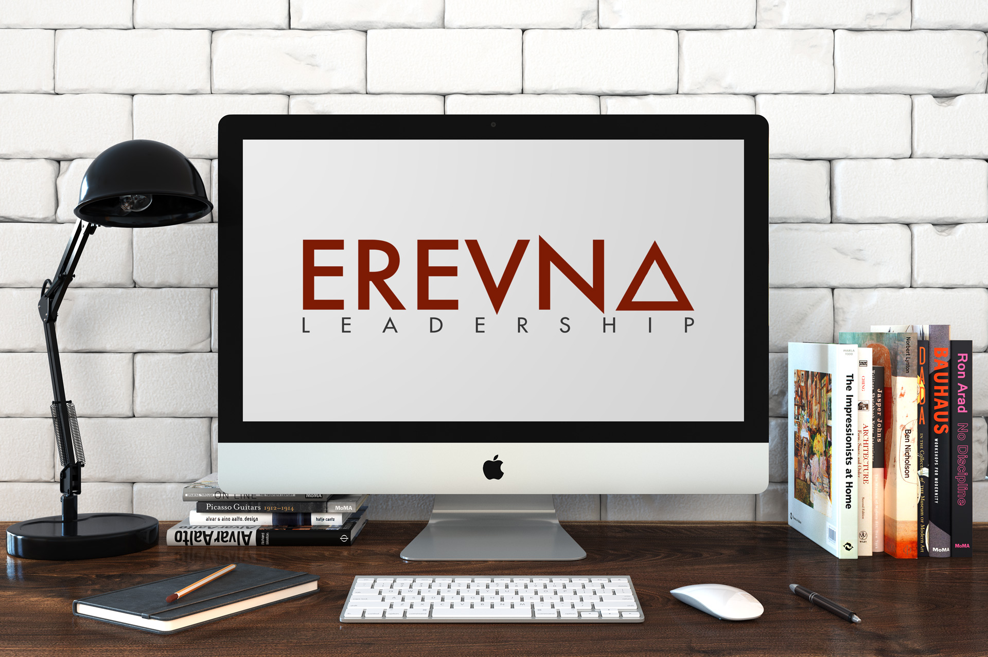
The concept for Erevna’s logo was meant to be simple, yet meaningful. The triangle, symbolizing change, reflects Erevna’s mission to transform the workplace into a more productive and meaningful one.
–02
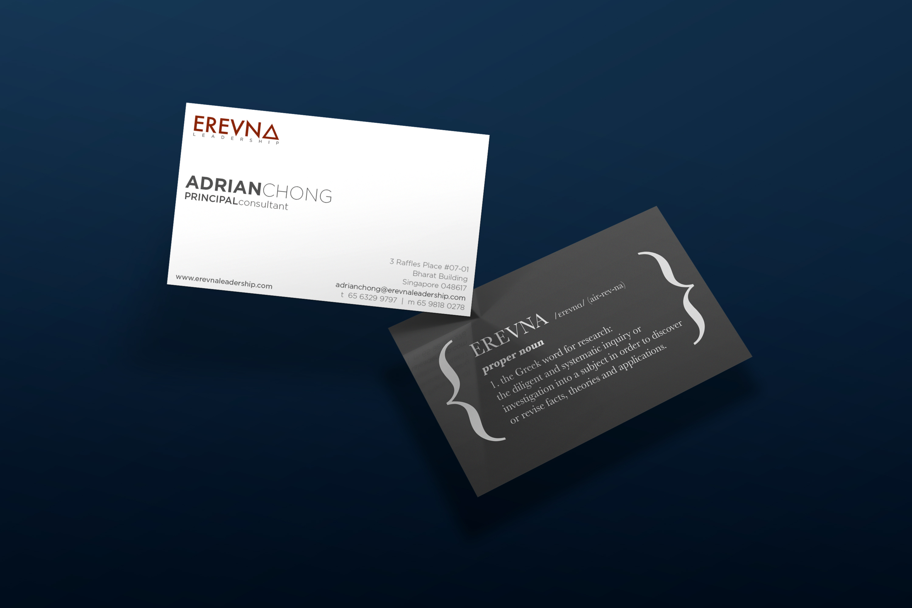
I aimed for the namecard to have a dual-purpose, providing information and also explaining what Erevna’s name means. I felt that this would give the reader a greater understanding of the company, as well as some background to the name.
–03
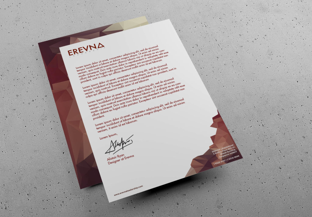
I used triangulated backgrounds to give the letterhead some life, yet keep true to the company colours.
–04
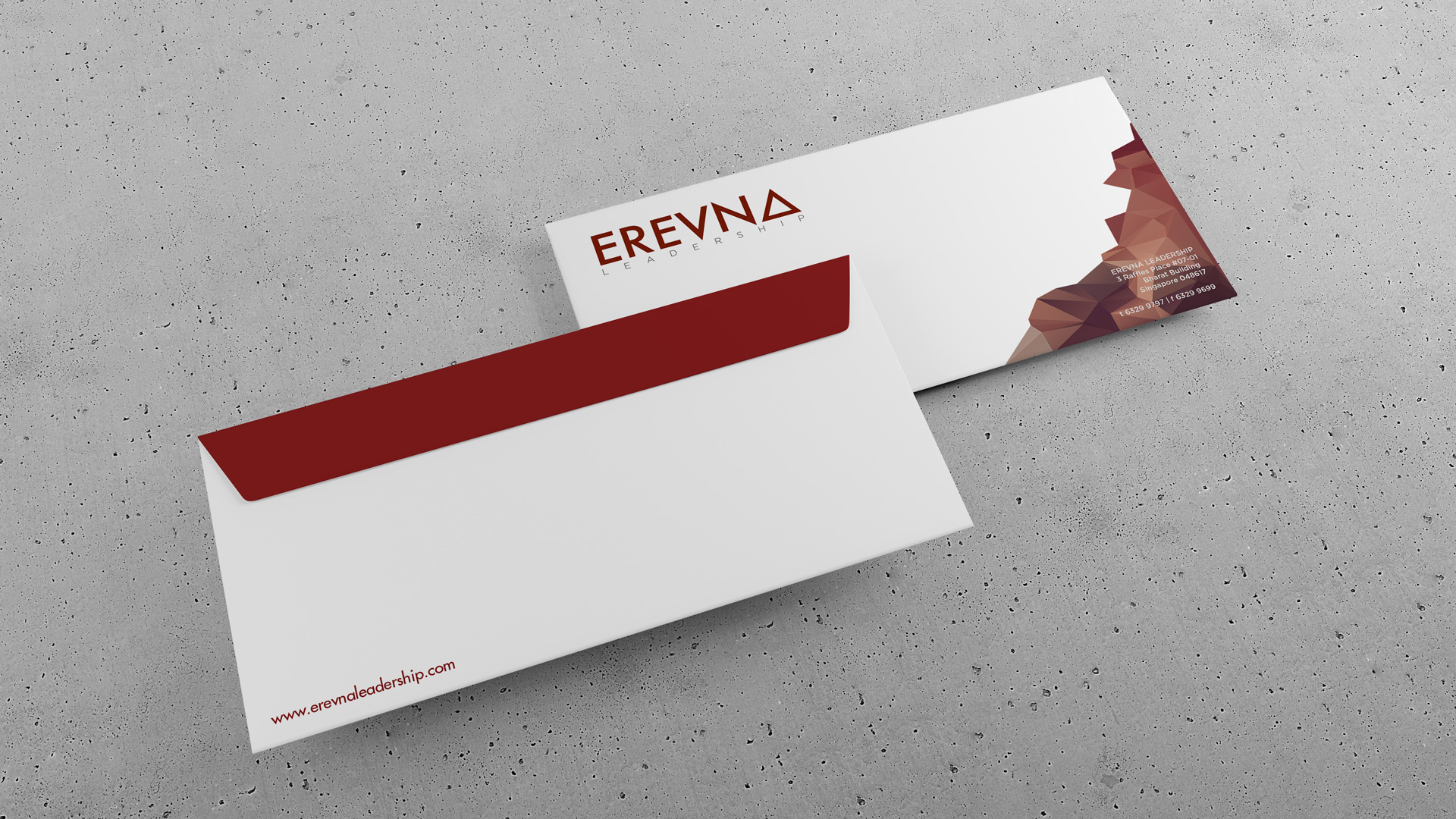
Using the same triangulated design for greater consistency, I designed the envelopes to match the brand and the letterheads they were sent out with.
–05
Some marketing/advertising material I developed for Erevna: I flipped the concept of motivated employees on its head and went with an unmotivated employee as the selling point instead. Text was marketed to be casual yet engaging.
–06
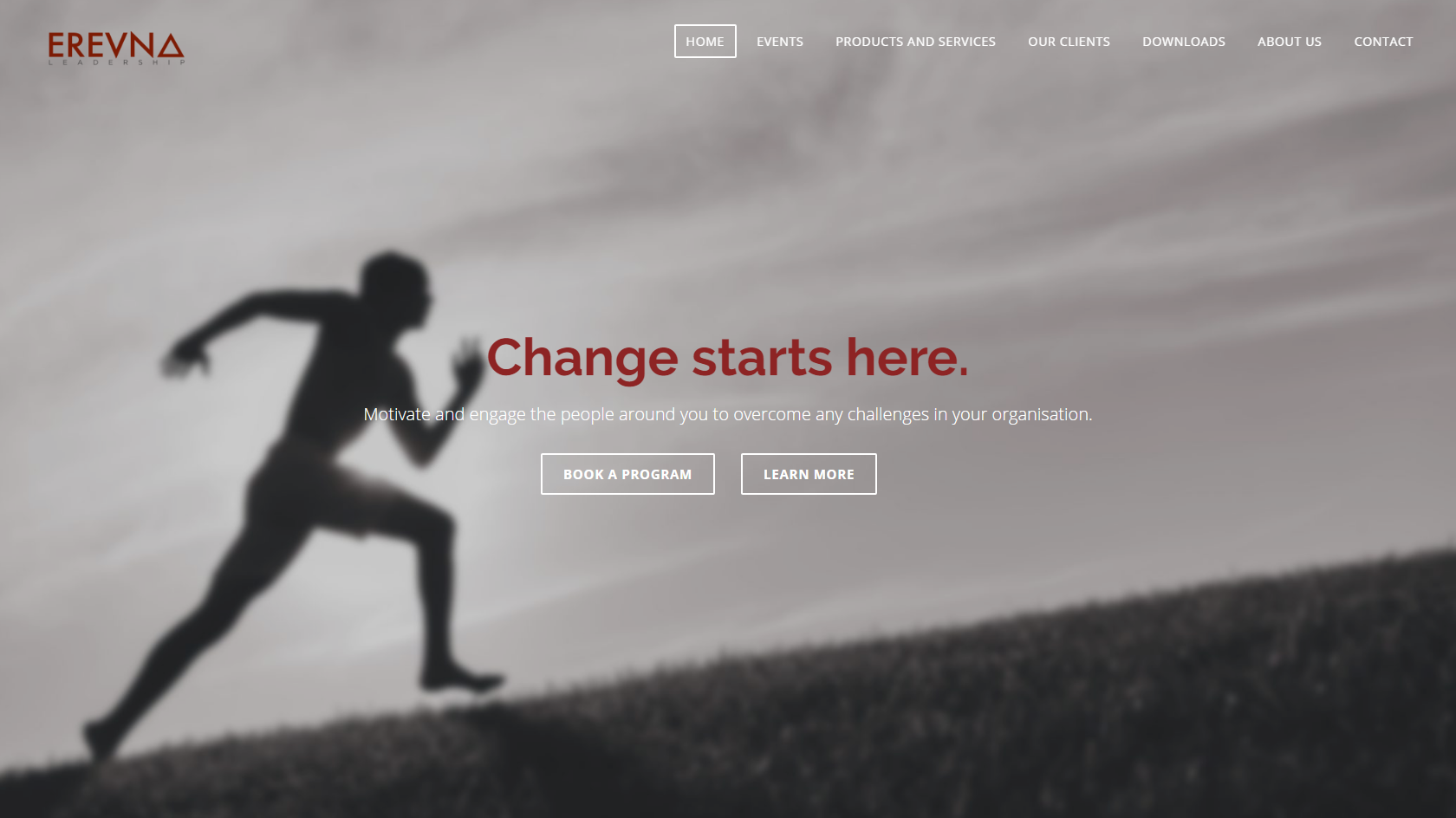
I continue to design and maintain the website’s functionality. You can visit it here.
